
We’re experts and innovators focused on solving challenges, embracing change and growing.
Expertise and solutions
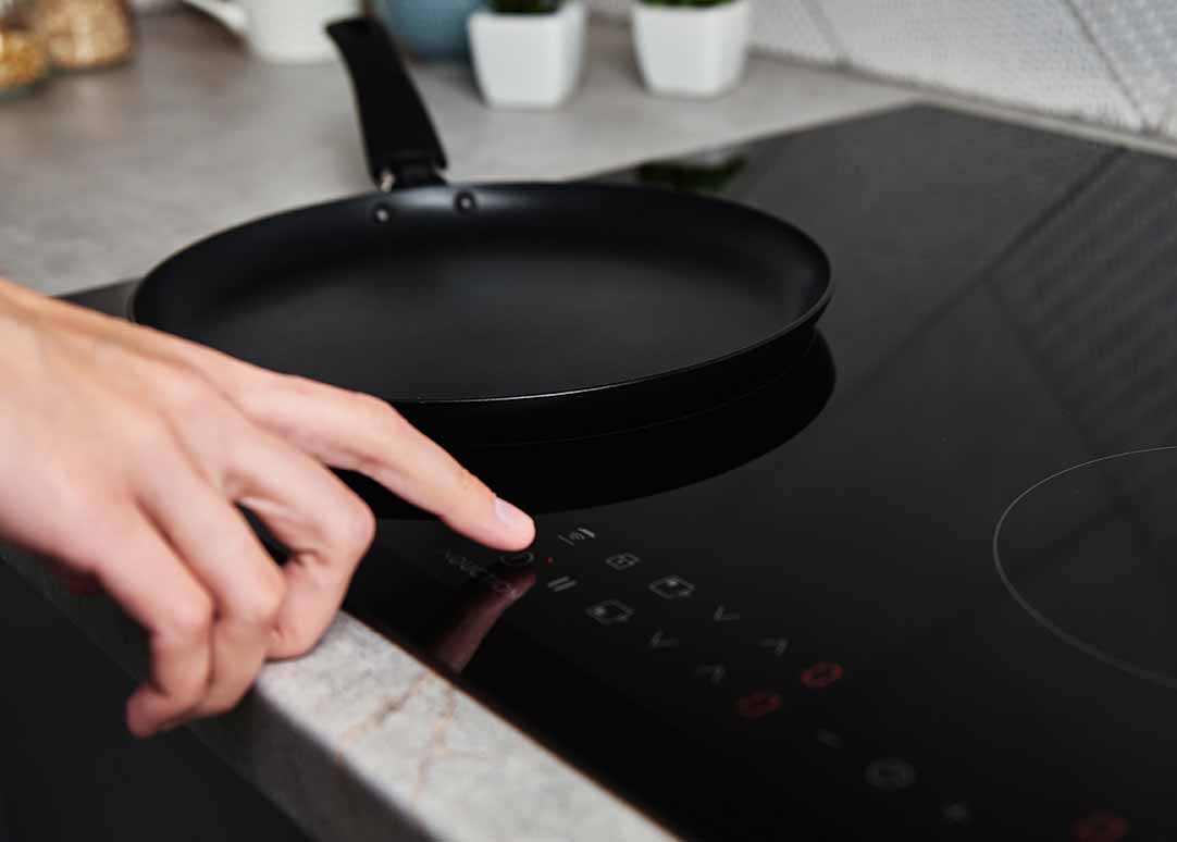
Our history as innovators and technical experts has made us a trusted advisor for our customers. Vibrantz products are used in technologies and applications all around us to make our world more colorful and add performance characteristics to everyday products that improve safety and increase durability.
EXPERTISE
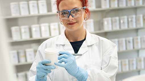
~400
dedicated R&D employees
Our areas of expertise
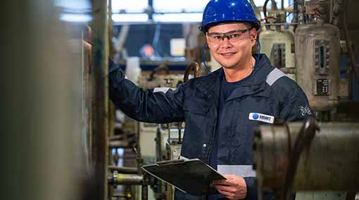
Advanced materials
We are the premier manufacturer of specialty mineral and chemical additives for a wide range of applications.
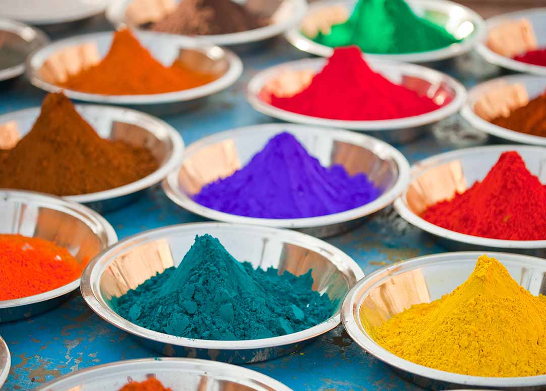
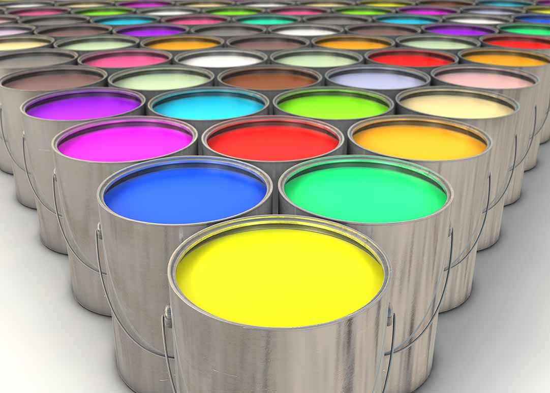
Advanced materialsColor solutions
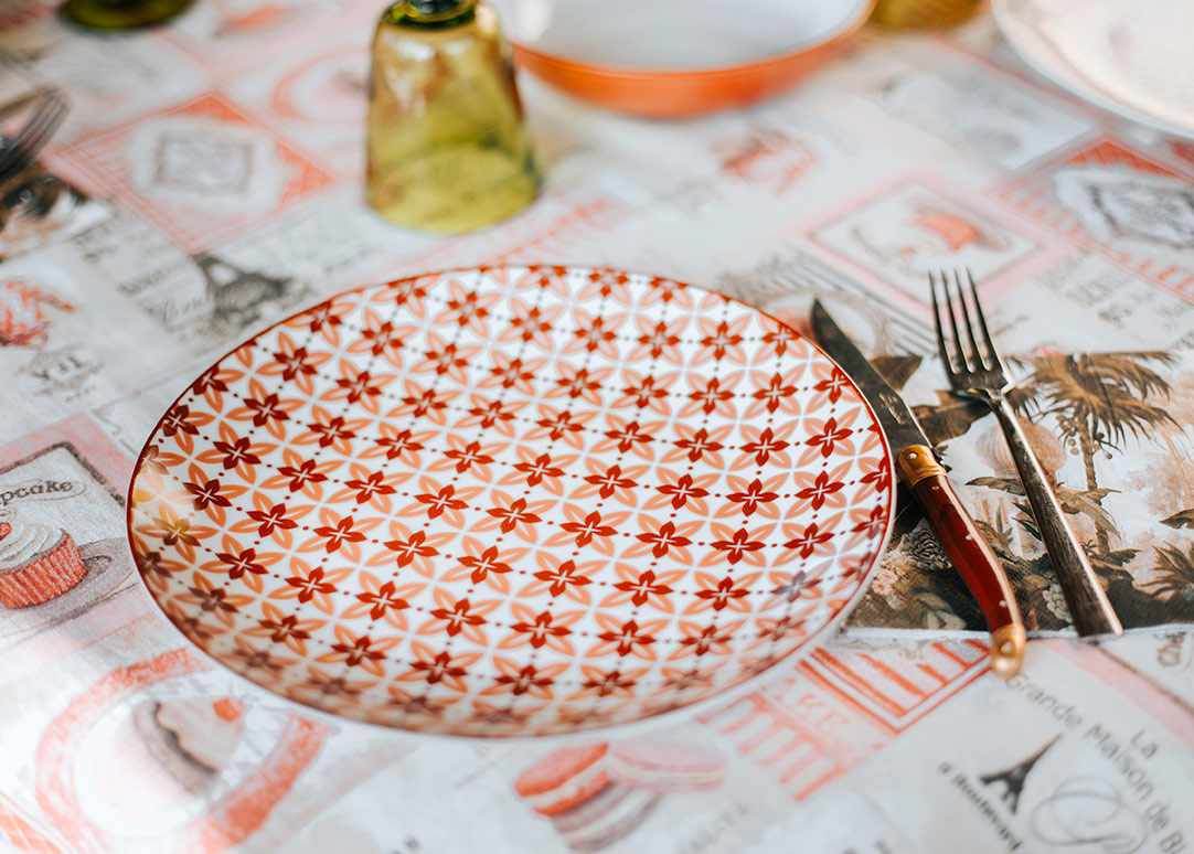
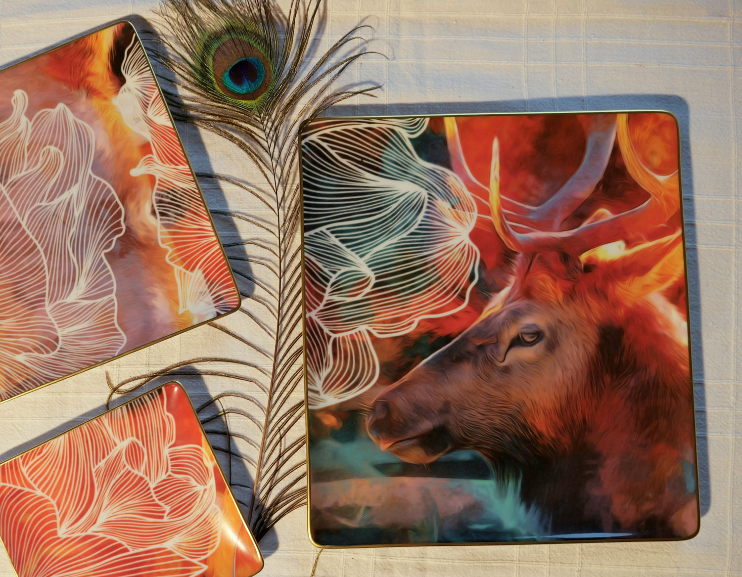
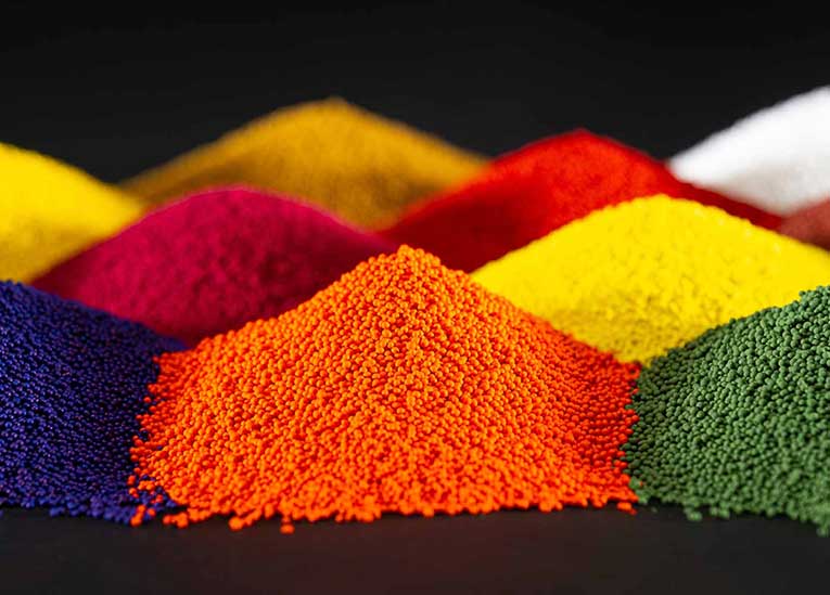
Our pigment, dispersion and colorant technologies lead the way globally in serving the paints, coatings, thermoset plastics, thermoplastics and residential and commercial construction markets.
Color solutionsPerformance coatings
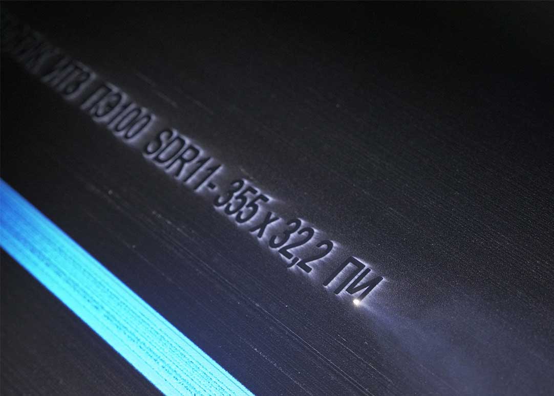
We provide functional glass coatings and porcelain enamel for industrial, automotive and decorative applications.
Performance coatingsExpertise and solutions

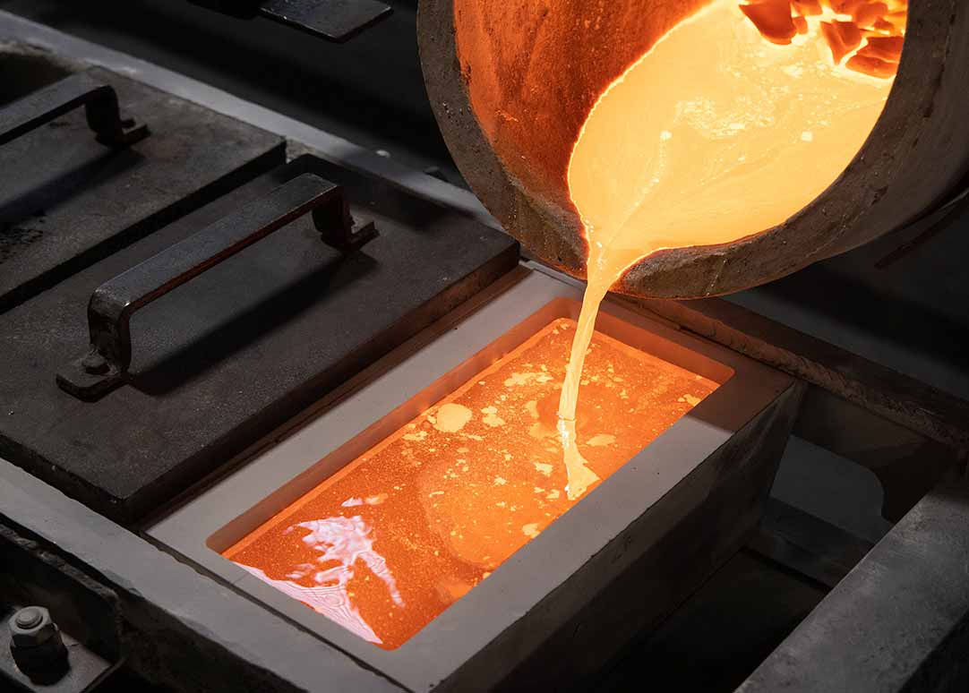

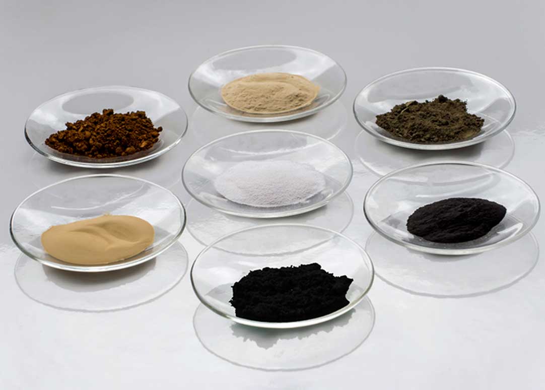
Advanced materials
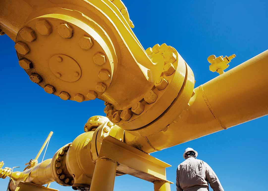
We are the leading supplier of specialty mineral additives and battery and electronic materials, providing value from source to solution.
- One of the largest global producers of fine manganese chemicals
- Widest range of mineral products for metallurgical industries
- Over 70 years of experience in the oil and gas industry
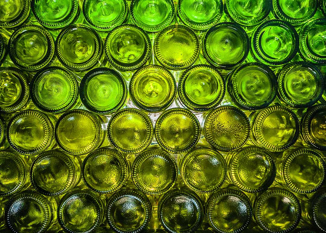
Color solutions
We provide the industry’s most diverse range of dry pigments and liquid dispersions to customers worldwide.
- Leading global supplier of colorants and tinting concepts for architectural and industrial coatings and plastics
- The world’s largest producer of complex inorganic color pigments and ultramarine blue pigments with manufacturing plants across three regions
- Developers of Innovatint — a cloud-based, point-of-sale, integrated tinting software that is efficient and easy to use for paint store staff
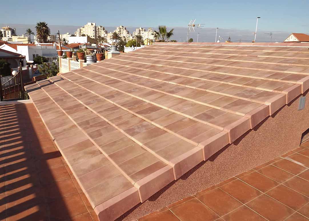
Performance coatings
We are the leading supplier of ceramic, glass and porcelain enamel coatings. Our materials can be found in high-value specialty products in markets such as automotive, construction and home appliances and decorations.
- Global supplier of glass and porcelain enamel coatings
- Products tailored with customers to create value in performance and cost
- Over 100 years of experience in porcelain enamel
Learn more
For detailed information on our product solutions or to speak to our team of experts, complete the form below.