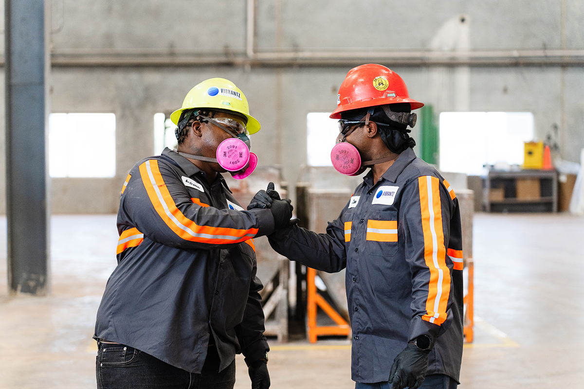
We’re experts and innovators focused on solving challenges, embracing change and growing.


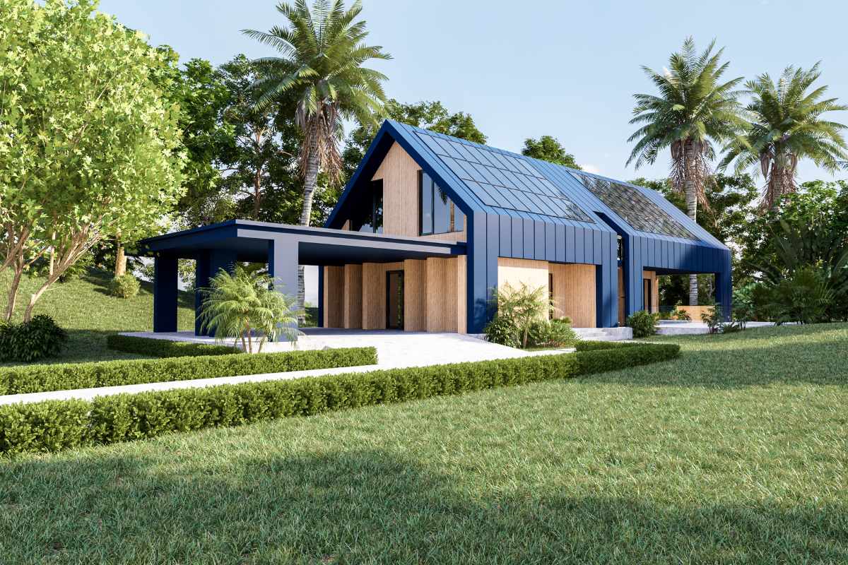
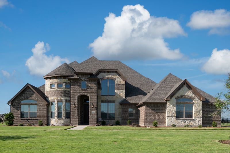
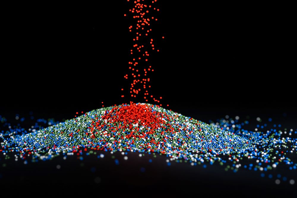
Building & Construction, Paints and coatings

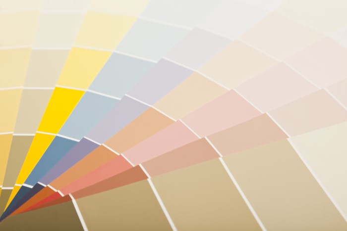
Maximizing energy efficiency with cool colors
27 March 2024 3 mins